View Full Case Study →
View Full Case Study →
Cypher
Cypher
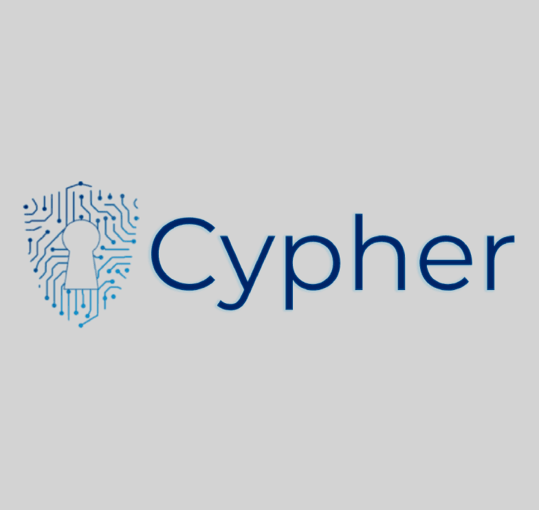
Cypher: A Logo for Unwavering Protection
tl;dr: Designed a modern and sophisticated logo for Cypher, a cybersecurity brand. The logo features a shield icon with an integrated circuit board pattern and keyhole, a clean sans-serif font (Montserrat), and a colour palette that evokes trust and innovation.
1. Concept & Inspiration:
Explored various concepts, including shields, data streams, and guardian figures.
The shield with a circuit board pattern and keyhole emerged as the most fitting representation of the brand's commitment to security and technology.
2. Icon Design:
The shield icon embodies the brand's core values of protection, vigilance, and innovation.
The geometric shape and intricate pattern convey strength, reliability, and the dynamic nature of cybersecurity.
3. Colour Palette:
Professional and sophisticated colours that evoke trust and authority.
Primary: Deep Blue (#002366)
Secondary: Black (#000000)
Accent 1: Electric Blue (#00A3E0)
Accent 2: Teal (#008080)
Accent 3: Light Grey (#D3D3D3)
4. Font Choice:
Montserrat, a modern and geometric sans-serif font.
Chosen for its versatility, readability, and ability to convey strength and sophistication.
5. Layout & Composition:
Balanced horizontal arrangement with a clear visual hierarchy.
The logomark and wordmark are strategically placed for optimal readability and impact.
6. Final Refinements:
Adjusted gradient within the shield for enhanced contrast.
Subtly darkened the keyhole outline for added depth.
Incorporated an inner glow and drop shadow to the wordmark for sophistication.
Refined spacing for improved visual balance.
7. Impact:
The final logo effectively communicates Cypher's brand identity and its promise of unwavering protection in the digital age.
The unique icon, colour palette, and font create a memorable and impactful visual representation of the brand's core values.