Cypher
Cypher
Cypher: A Symbol of Security in the Digital Age
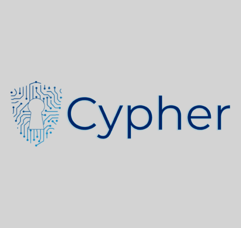
Cypher is a cybersecurity brand dedicated to providing businesses with impenetrable security solutions in a constantly evolving digital landscape. The logo design aimed to capture the brand's essence of unwavering protection, vigilance, and innovation through a modern, clean, and visually striking symbol.
Initial Exploration & Concept Development:
The design process began with an in-depth analysis of Cypher's brand essence, personality, story, and target audience. We explored various visual concepts, including shields, locks, data streams, and guardian figures. Through brainstorming and iteration, the concept of a shield with an integrated circuit board pattern emerged as the most fitting representation of the brand's commitment to both technological innovation and robust security.
Crafting the Icon:
The shield icon, a central element of the logo, was meticulously crafted to embody the brand's core values. The geometric shape of the shield conveys strength and reliability, while the intricate circuit board pattern within represents the dynamic and ever-changing nature of the digital world. The addition of a keyhole at the centre further emphasizes the brand's focus on security and access control.
Color Palette: A Reflection of Strength and Sophistication:
The colour palette was carefully selected to evoke a sense of professionalism, security, and technological advancement. The deep blue primary colour represents trust, authority, and stability, while the black secondary colour conveys power, elegance, and sophistication. The electric blue accent colour adds a touch of dynamism and innovation, highlighting the brand's forward-thinking approach.
Font Choice: Modern and Geometric:
The font selection focused on complementing the geometric and modern aesthetic of the logomark. Montserrat, a sans-serif font with clean lines and a geometric structure, was chosen for its versatility, readability, and ability to convey both strength and sophistication.
Layout & Composition: Balancing Elements:
The logo's layout was designed to create a balanced and harmonious composition. The horizontal arrangement of the logomark and wordmark conveys a sense of stability and professionalism. The spacing between the elements was carefully adjusted to ensure visual hierarchy and readability.
Final Touches & Refinements:
Final refinements included adjusting the gradient within the shield to enhance contrast and visual appeal, subtly darkening the keyhole outline to add depth, and incorporating an inner glow and drop shadow to the wordmark for a touch of sophistication and dimension. The spacing between the logomark and wordmark was further refined to optimize visual balance and cohesion.
Impact & Results:
The final logo effectively communicates Cypher's brand identity and its promise of unwavering protection in the digital age. The unique combination of the shield icon, the circuit board pattern, and the modern font creates a memorable and impactful visual representation of the brand's core values and commitment to providing cutting-edge security solutions.
Cypher: A Symbol of Security in the Digital Age
Cypher is a cybersecurity brand dedicated to providing businesses with impenetrable security solutions in a constantly evolving digital landscape. The logo design aimed to capture the brand's essence of unwavering protection, vigilance, and innovation through a modern, clean, and visually striking symbol.
Initial Exploration & Concept Development:
The design process began with an in-depth analysis of Cypher's brand essence, personality, story, and target audience. We explored various visual concepts, including shields, locks, data streams, and guardian figures. Through brainstorming and iteration, the concept of a shield with an integrated circuit board pattern emerged as the most fitting representation of the brand's commitment to both technological innovation and robust security.
Crafting the Icon:
The shield icon, a central element of the logo, was meticulously crafted to embody the brand's core values. The geometric shape of the shield conveys strength and reliability, while the intricate circuit board pattern within represents the dynamic and ever-changing nature of the digital world. The addition of a keyhole at the centre further emphasizes the brand's focus on security and access control.
Color Palette: A Reflection of Strength and Sophistication:
The colour palette was carefully selected to evoke a sense of professionalism, security, and technological advancement. The deep blue primary colour represents trust, authority, and stability, while the black secondary colour conveys power, elegance, and sophistication. The electric blue accent colour adds a touch of dynamism and innovation, highlighting the brand's forward-thinking approach.
Font Choice: Modern and Geometric:
The font selection focused on complementing the geometric and modern aesthetic of the logomark. Montserrat, a sans-serif font with clean lines and a geometric structure, was chosen for its versatility, readability, and ability to convey both strength and sophistication.
Layout & Composition: Balancing Elements:
The logo's layout was designed to create a balanced and harmonious composition. The horizontal arrangement of the logomark and wordmark conveys a sense of stability and professionalism. The spacing between the elements was carefully adjusted to ensure visual hierarchy and readability.
Final Touches & Refinements:
Final refinements included adjusting the gradient within the shield to enhance contrast and visual appeal, subtly darkening the keyhole outline to add depth, and incorporating an inner glow and drop shadow to the wordmark for a touch of sophistication and dimension. The spacing between the logomark and wordmark was further refined to optimize visual balance and cohesion.
Impact & Results:
The final logo effectively communicates Cypher's brand identity and its promise of unwavering protection in the digital age. The unique combination of the shield icon, the circuit board pattern, and the modern font creates a memorable and impactful visual representation of the brand's core values and commitment to providing cutting-edge security solutions.