Tomas
Tomas
The "Tomas" Brand:
"Tomas" is a men's body care brand focused on empowering men to embrace their unique strength and masculinity through high-quality grooming products. The brand combines rugged functionality with sophisticated style, offering a range of products that enhance confidence and self-assurance.
Brand Identity Design Process:
The design process aimed to create a visual identity that embodies the "Tomas" brand essence and resonates with its target audience.
1. Logos:
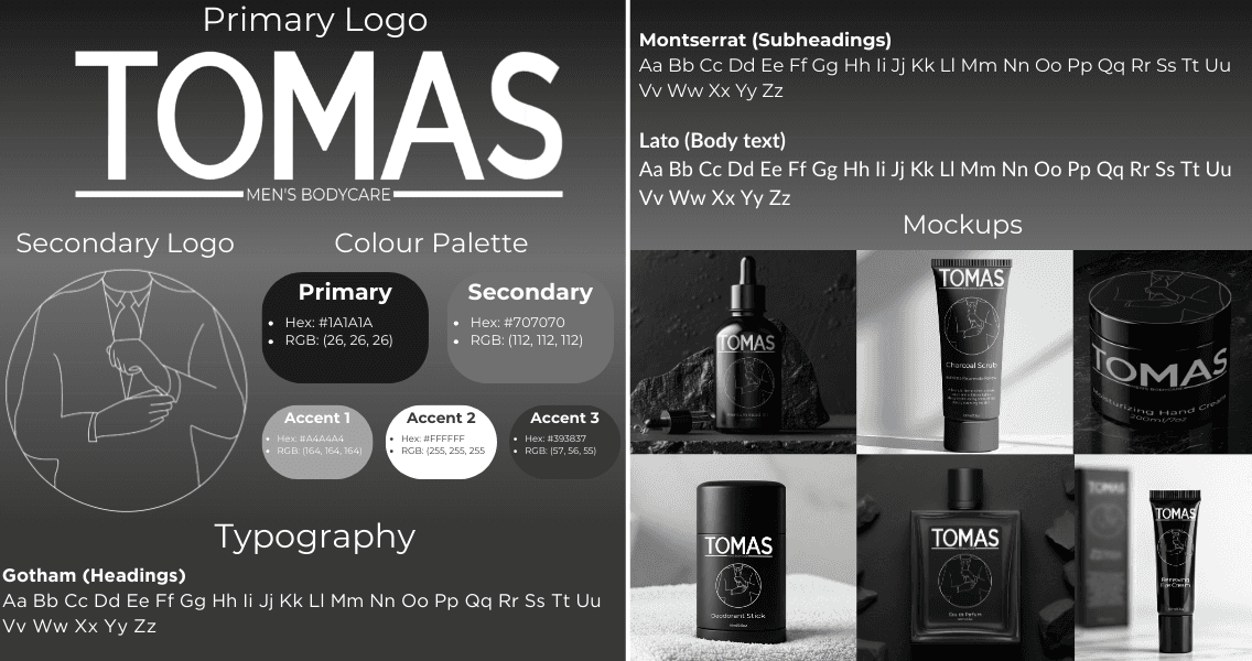
Primary Logo: Features a bold, custom wordmark with clean lines and a strong presence.
Secondary Logo (Symbol): A minimalist illustration of a man adjusting his sleeve, subtly conveying confidence and attention to detail.
2. Typography:
Headings: Gotham Bold - A strong, geometric sans-serif font that exudes confidence and modernity.
Subheadings: Montserrat Regular - A versatile and contemporary sans-serif font that provides a balance of strength and approachability.
Body Text: Lato Regular - A highly legible and friendly sans-serif font that ensures clear communication.
3. Colour Palette:
Primary: Charcoal Black (#1A1A1A) - Evokes strength, sophistication, and a timeless appeal.
Secondary: Steel Gray (#707070) - Adds depth and dimension while maintaining a monochromatic aesthetic.
Accent 1: Gunmetal (#A4A4A4) - Provides subtle highlights and accents.
Accent 2: White (#FFFFFF) - Offers a clean contrast and enhances readability.
Additional: Deep Gray (#393837) - Adds a nuanced variation within the grayscale range.
4. Mock-ups:
A range of mock-ups was created to showcase the brand identity in action, including:
Cologne mock-up
Beard oil mock-up
Hand cream mock-up
Eye cream mock-up
Charcoal scrub mock-up
Deodorant stick mock-up
These mock-ups demonstrate how the brand elements can be applied across various product categories, ensuring consistency and visual appeal.
Reasoning Behind the Design Choices:
Logos: The primary logo is strong and impactful, while the symbol adds a unique and memorable element that subtly conveys the brand's message.
Typography: The chosen fonts provide a balance of strength, modernity, and readability, ensuring a cohesive and user-friendly experience.
Colour Palette: The grayscale palette creates a sophisticated and timeless aesthetic, reflecting the brand's focus on quality and refinement.
Mock-ups: The mock-ups demonstrate the brand's versatility and its ability to translate across various product categories, ensuring a consistent and impactful brand presence.
Overall:
The "Tomas" brand identity is a cohesive and well-defined visual system that effectively captures the brand's values, offerings, and target audience. The design choices reflect the brand's commitment to empowering men through high-quality grooming products that enhance confidence and self-assurance.
The "Tomas" Brand:
"Tomas" is a men's body care brand focused on empowering men to embrace their unique strength and masculinity through high-quality grooming products. The brand combines rugged functionality with sophisticated style, offering a range of products that enhance confidence and self-assurance.
Brand Identity Design Process:
The design process aimed to create a visual identity that embodies the "Tomas" brand essence and resonates with its target audience.
1. Logos:
Primary Logo: Features a bold, custom wordmark with clean lines and a strong presence.
Secondary Logo (Symbol): A minimalist illustration of a man adjusting his sleeve, subtly conveying confidence and attention to detail.
2. Typography:
Headings: Gotham Bold - A strong, geometric sans-serif font that exudes confidence and modernity.
Subheadings: Montserrat Regular - A versatile and contemporary sans-serif font that provides a balance of strength and approachability.
Body Text: Lato Regular - A highly legible and friendly sans-serif font that ensures clear communication.
3. Colour Palette:
Primary: Charcoal Black (#1A1A1A) - Evokes strength, sophistication, and a timeless appeal.
Secondary: Steel Gray (#707070) - Adds depth and dimension while maintaining a monochromatic aesthetic.
Accent 1: Gunmetal (#A4A4A4) - Provides subtle highlights and accents.
Accent 2: White (#FFFFFF) - Offers a clean contrast and enhances readability.
Additional: Deep Gray (#393837) - Adds a nuanced variation within the grayscale range.
4. Mock-ups:
A range of mock-ups was created to showcase the brand identity in action, including:
Cologne mock-up
Beard oil mock-up
Hand cream mock-up
Eye cream mock-up
Charcoal scrub mock-up
Deodorant stick mock-up
These mock-ups demonstrate how the brand elements can be applied across various product categories, ensuring consistency and visual appeal.
Reasoning Behind the Design Choices:
Logos: The primary logo is strong and impactful, while the symbol adds a unique and memorable element that subtly conveys the brand's message.
Typography: The chosen fonts provide a balance of strength, modernity, and readability, ensuring a cohesive and user-friendly experience.
Colour Palette: The grayscale palette creates a sophisticated and timeless aesthetic, reflecting the brand's focus on quality and refinement.
Mock-ups: The mock-ups demonstrate the brand's versatility and its ability to translate across various product categories, ensuring a consistent and impactful brand presence.
Overall:
The "Tomas" brand identity is a cohesive and well-defined visual system that effectively captures the brand's values, offerings, and target audience. The design choices reflect the brand's commitment to empowering men through high-quality grooming products that enhance confidence and self-assurance.