The Painted Canvas
The Painted Canvas
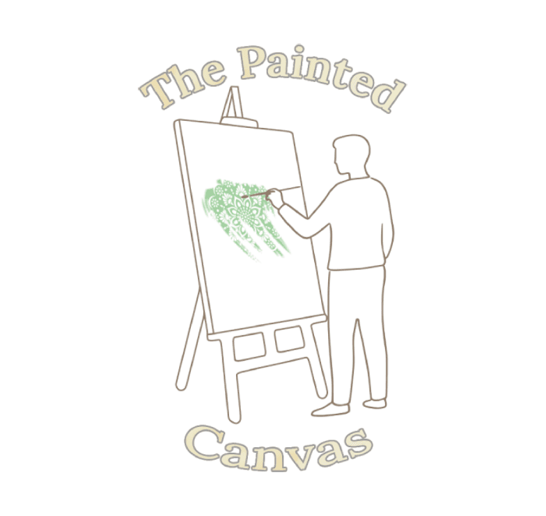
The Painted Canvas: A Logo for Inner Peace
tl;dr: Designed a serene and elegant logo for "The Painted Canvas," a wellness-focused art studio. The logo features a minimalist icon of a person painting, a calming colour palette, and a sophisticated font.
Concept & Inspiration:
Explored various concepts, including flowing brushstrokes and mandalas.
The icon of a person painting emerged as the most fitting representation of the brand's focus on self-expression and well-being.
Icon Design:
The minimalist icon embodies the brand's serene and approachable personality.
The gentle pose of the figure painting on a canvas symbolizes the act of creative expression and self-discovery.
Colour Palette:
Calming and inviting colours inspired by nature.
Primary: Sage Green, Soft Ivory
Secondary: Sky Blue, Warm Grey
Font Choice:
Elegant and approachable Lora font with a classic look.
Complements the minimalist icon and conveys a sense of sophistication and trustworthiness.
Layout & Composition:
Balanced and harmonious composition with a clear visual hierarchy.
The icon and text are strategically placed for readability.
Subtle arc of the text adds dynamism and complements the brushstroke.
Final Refinements:
Added a subtle brushstroke texture to the text.
Incorporated a mandala pattern within the brushstroke to symbolize mindfulness.
Adjusted the opacity of the brushstroke to enhance contrast.
Impact:
The final logo effectively communicates the brand's identity and its promise of fostering inner peace through artistic expression.
The calming colour palette, minimalist icon, and mindful symbolism resonate with the target audience.
View Full Case Study →
View Full Case Study →