Prison Break: Season 5
Prison Break: Season 5
Prison Break: Season 5
Prison Break: Season 5
Prison Break: Season 5
Prison Break: Season 5
Prison Break: Season 5
Prison Break (Seasons 4 & 5): Streaming & Broadcast Key Art
1. Brief & Commercial Objective
A promotional key art series developed for Prison Break (Seasons 4 and 5) to reignite audience interest, support broadcast season premieres, and drive high-volume streaming catch-up on digital platforms.
2. Target Audience & Campaign Strategy
Audience: Thriller and crime drama television viewers, legacy franchise fans, and binge-watching streaming subscribers.
Campaign Strategy: Leverage narrative tension, high-stakes character dynamics, and iconic motif imagery (cages, barbed wire, shadow) to compel viewership and season retention.
3. Strategic Visual Choices
Season 4: Conspiracy & Espionage
Composition: Three-tier alignment placing antagonists at the top and Michael Scofield’s core team centrally, reflecting shifting allegiances and covert operations against The Company.
Color Psychology: Cool, desaturated tones and shadowed lighting reflect the clandestine, high-surveillance nature of the plot.
Season 5: Yemen Escape & International Stakes
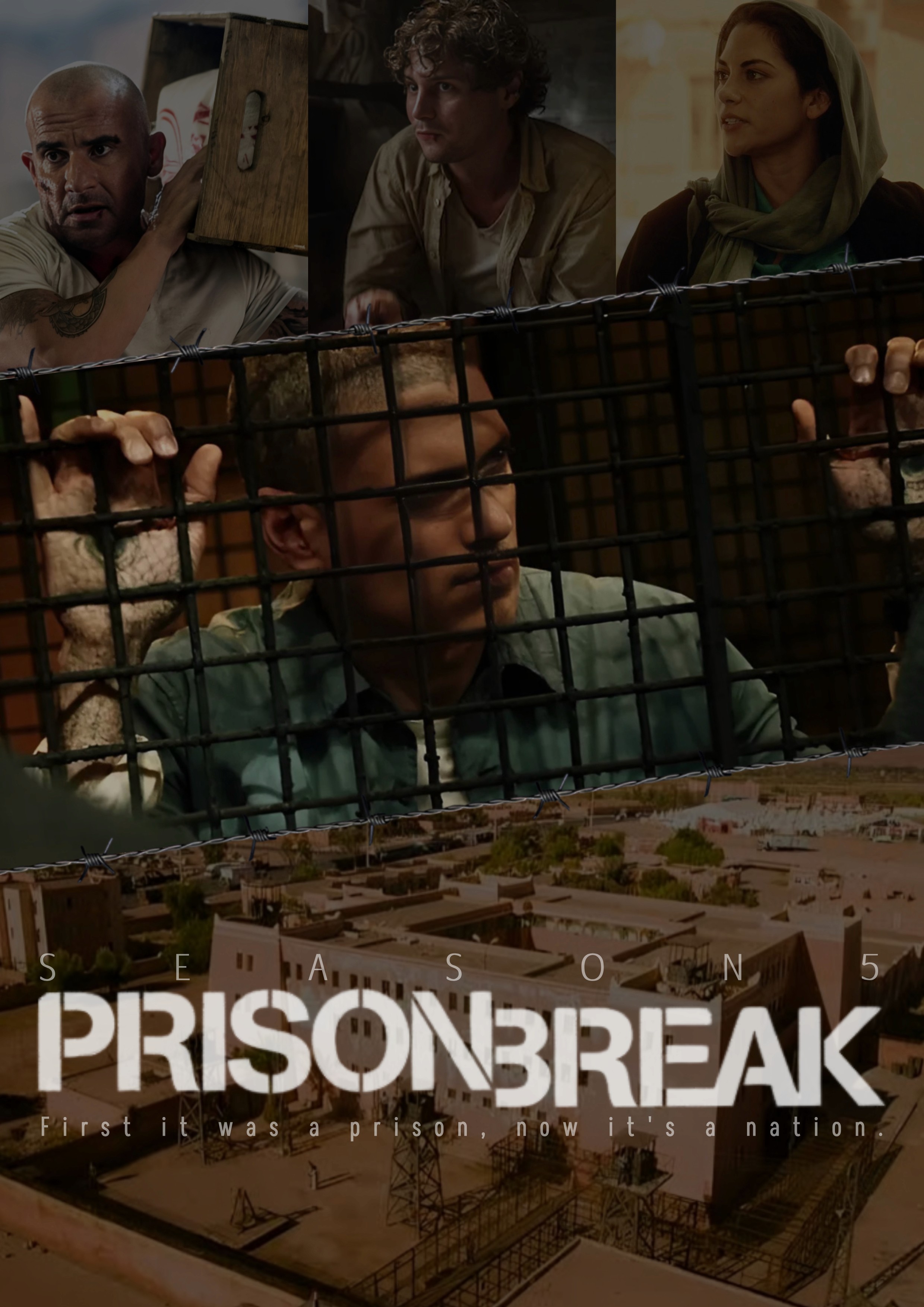
Composition: Frames Michael Scofield behind metal cage bars in the center, flanked by his rescue team and grounded by an expanse shot of Ogygia Prison.
Color Psychology & Symbolism: Warm, dusty Middle Eastern color grading and subtle barbed-wire dividers communicate harsh climate, entrapment, and high-risk survival.
Typography: Official series title font paired with clean sans-serif secondary typography to preserve franchise recognition while maintaining modern promotional polish.
4. Multi-Channel Execution & Touchpoints
Broadcast Promotion: High-impact promotional key art formatted for television network ad slots and digital program guides.
Streaming Platform Banners: Optimized landscape and portrait thumbnails tailored for Netflix and Hulu platform interfaces.
Prison Break (Seasons 4 & 5): Streaming & Broadcast Key Art
1. Brief & Commercial Objective
A promotional key art series developed for Prison Break (Seasons 4 and 5) to reignite audience interest, support broadcast season premieres, and drive high-volume streaming catch-up on digital platforms.
2. Target Audience & Campaign Strategy
Audience: Thriller and crime drama television viewers, legacy franchise fans, and binge-watching streaming subscribers.
Campaign Strategy: Leverage narrative tension, high-stakes character dynamics, and iconic motif imagery (cages, barbed wire, shadow) to compel viewership and season retention.
3. Strategic Visual Choices
Season 4: Conspiracy & Espionage
Composition: Three-tier alignment placing antagonists at the top and Michael Scofield’s core team centrally, reflecting shifting allegiances and covert operations against The Company.
Color Psychology: Cool, desaturated tones and shadowed lighting reflect the clandestine, high-surveillance nature of the plot.
Season 5: Yemen Escape & International Stakes
Composition: Frames Michael Scofield behind metal cage bars in the center, flanked by his rescue team and grounded by an expanse shot of Ogygia Prison.
Color Psychology & Symbolism: Warm, dusty Middle Eastern color grading and subtle barbed-wire dividers communicate harsh climate, entrapment, and high-risk survival.
Typography: Official series title font paired with clean sans-serif secondary typography to preserve franchise recognition while maintaining modern promotional polish.
4. Multi-Channel Execution & Touchpoints
Broadcast Promotion: High-impact promotional key art formatted for television network ad slots and digital program guides.
Streaming Platform Banners: Optimized landscape and portrait thumbnails tailored for Netflix and Hulu platform interfaces.
Prison Break (Seasons 4 & 5): Streaming & Broadcast Key Art
1. Brief & Commercial Objective
A promotional key art series developed for Prison Break (Seasons 4 and 5) to reignite audience interest, support broadcast season premieres, and drive high-volume streaming catch-up on digital platforms.
2. Target Audience & Campaign Strategy
Audience: Thriller and crime drama television viewers, legacy franchise fans, and binge-watching streaming subscribers.
Campaign Strategy: Leverage narrative tension, high-stakes character dynamics, and iconic motif imagery (cages, barbed wire, shadow) to compel viewership and season retention.
3. Strategic Visual Choices
Season 4: Conspiracy & Espionage
Composition: Three-tier alignment placing antagonists at the top and Michael Scofield’s core team centrally, reflecting shifting allegiances and covert operations against The Company.
Color Psychology: Cool, desaturated tones and shadowed lighting reflect the clandestine, high-surveillance nature of the plot.
Season 5: Yemen Escape & International Stakes
Composition: Frames Michael Scofield behind metal cage bars in the center, flanked by his rescue team and grounded by an expanse shot of Ogygia Prison.
Color Psychology & Symbolism: Warm, dusty Middle Eastern color grading and subtle barbed-wire dividers communicate harsh climate, entrapment, and high-risk survival.
Typography: Official series title font paired with clean sans-serif secondary typography to preserve franchise recognition while maintaining modern promotional polish.
4. Multi-Channel Execution & Touchpoints
Broadcast Promotion: High-impact promotional key art formatted for television network ad slots and digital program guides.
Streaming Platform Banners: Optimized landscape and portrait thumbnails tailored for Netflix and Hulu platform interfaces.
Prison Break (Seasons 4 & 5): Streaming & Broadcast Key Art
1. Brief & Commercial Objective
A promotional key art series developed for Prison Break (Seasons 4 and 5) to reignite audience interest, support broadcast season premieres, and drive high-volume streaming catch-up on digital platforms.
2. Target Audience & Campaign Strategy
Audience: Thriller and crime drama television viewers, legacy franchise fans, and binge-watching streaming subscribers.
Campaign Strategy: Leverage narrative tension, high-stakes character dynamics, and iconic motif imagery (cages, barbed wire, shadow) to compel viewership and season retention.
3. Strategic Visual Choices
Season 4: Conspiracy & Espionage
Composition: Three-tier alignment placing antagonists at the top and Michael Scofield’s core team centrally, reflecting shifting allegiances and covert operations against The Company.
Color Psychology: Cool, desaturated tones and shadowed lighting reflect the clandestine, high-surveillance nature of the plot.
Season 5: Yemen Escape & International Stakes
Composition: Frames Michael Scofield behind metal cage bars in the center, flanked by his rescue team and grounded by an expanse shot of Ogygia Prison.
Color Psychology & Symbolism: Warm, dusty Middle Eastern color grading and subtle barbed-wire dividers communicate harsh climate, entrapment, and high-risk survival.
Typography: Official series title font paired with clean sans-serif secondary typography to preserve franchise recognition while maintaining modern promotional polish.
4. Multi-Channel Execution & Touchpoints
Broadcast Promotion: High-impact promotional key art formatted for television network ad slots and digital program guides.
Streaming Platform Banners: Optimized landscape and portrait thumbnails tailored for Netflix and Hulu platform interfaces.
Prison Break (Seasons 4 & 5): Streaming & Broadcast Key Art
1. Brief & Commercial Objective
A promotional key art series developed for Prison Break (Seasons 4 and 5) to reignite audience interest, support broadcast season premieres, and drive high-volume streaming catch-up on digital platforms.
2. Target Audience & Campaign Strategy
Audience: Thriller and crime drama television viewers, legacy franchise fans, and binge-watching streaming subscribers.
Campaign Strategy: Leverage narrative tension, high-stakes character dynamics, and iconic motif imagery (cages, barbed wire, shadow) to compel viewership and season retention.
3. Strategic Visual Choices
Season 4: Conspiracy & Espionage
Composition: Three-tier alignment placing antagonists at the top and Michael Scofield’s core team centrally, reflecting shifting allegiances and covert operations against The Company.
Color Psychology: Cool, desaturated tones and shadowed lighting reflect the clandestine, high-surveillance nature of the plot.
Season 5: Yemen Escape & International Stakes
Composition: Frames Michael Scofield behind metal cage bars in the center, flanked by his rescue team and grounded by an expanse shot of Ogygia Prison.
Color Psychology & Symbolism: Warm, dusty Middle Eastern color grading and subtle barbed-wire dividers communicate harsh climate, entrapment, and high-risk survival.
Typography: Official series title font paired with clean sans-serif secondary typography to preserve franchise recognition while maintaining modern promotional polish.
4. Multi-Channel Execution & Touchpoints
Broadcast Promotion: High-impact promotional key art formatted for television network ad slots and digital program guides.
Streaming Platform Banners: Optimized landscape and portrait thumbnails tailored for Netflix and Hulu platform interfaces.
Prison Break (Seasons 4 & 5): Streaming & Broadcast Key Art
1. Brief & Commercial Objective
A promotional key art series developed for Prison Break (Seasons 4 and 5) to reignite audience interest, support broadcast season premieres, and drive high-volume streaming catch-up on digital platforms.
2. Target Audience & Campaign Strategy
Audience: Thriller and crime drama television viewers, legacy franchise fans, and binge-watching streaming subscribers.
Campaign Strategy: Leverage narrative tension, high-stakes character dynamics, and iconic motif imagery (cages, barbed wire, shadow) to compel viewership and season retention.
3. Strategic Visual Choices
Season 4: Conspiracy & Espionage
Composition: Three-tier alignment placing antagonists at the top and Michael Scofield’s core team centrally, reflecting shifting allegiances and covert operations against The Company.
Color Psychology: Cool, desaturated tones and shadowed lighting reflect the clandestine, high-surveillance nature of the plot.
Season 5: Yemen Escape & International Stakes
Composition: Frames Michael Scofield behind metal cage bars in the center, flanked by his rescue team and grounded by an expanse shot of Ogygia Prison.
Color Psychology & Symbolism: Warm, dusty Middle Eastern color grading and subtle barbed-wire dividers communicate harsh climate, entrapment, and high-risk survival.
Typography: Official series title font paired with clean sans-serif secondary typography to preserve franchise recognition while maintaining modern promotional polish.
4. Multi-Channel Execution & Touchpoints
Broadcast Promotion: High-impact promotional key art formatted for television network ad slots and digital program guides.
Streaming Platform Banners: Optimized landscape and portrait thumbnails tailored for Netflix and Hulu platform interfaces.
Prison Break (Seasons 4 & 5): Streaming & Broadcast Key Art
1. Brief & Commercial Objective
A promotional key art series developed for Prison Break (Seasons 4 and 5) to reignite audience interest, support broadcast season premieres, and drive high-volume streaming catch-up on digital platforms.
2. Target Audience & Campaign Strategy
Audience: Thriller and crime drama television viewers, legacy franchise fans, and binge-watching streaming subscribers.
Campaign Strategy: Leverage narrative tension, high-stakes character dynamics, and iconic motif imagery (cages, barbed wire, shadow) to compel viewership and season retention.
3. Strategic Visual Choices
Season 4: Conspiracy & Espionage
Composition: Three-tier alignment placing antagonists at the top and Michael Scofield’s core team centrally, reflecting shifting allegiances and covert operations against The Company.
Color Psychology: Cool, desaturated tones and shadowed lighting reflect the clandestine, high-surveillance nature of the plot.
Season 5: Yemen Escape & International Stakes
Composition: Frames Michael Scofield behind metal cage bars in the center, flanked by his rescue team and grounded by an expanse shot of Ogygia Prison.
Color Psychology & Symbolism: Warm, dusty Middle Eastern color grading and subtle barbed-wire dividers communicate harsh climate, entrapment, and high-risk survival.
Typography: Official series title font paired with clean sans-serif secondary typography to preserve franchise recognition while maintaining modern promotional polish.
4. Multi-Channel Execution & Touchpoints
Broadcast Promotion: High-impact promotional key art formatted for television network ad slots and digital program guides.
Streaming Platform Banners: Optimized landscape and portrait thumbnails tailored for Netflix and Hulu platform interfaces.
Let's start
creating together
Let’s start
creating together
Let’s start
creating together
Let’s start
creating together
Let’s start
creating together
Let’s start
creating together
Let’s start
creating together