Prison Break: Season 5
Prison Break: Season 5
About the Series
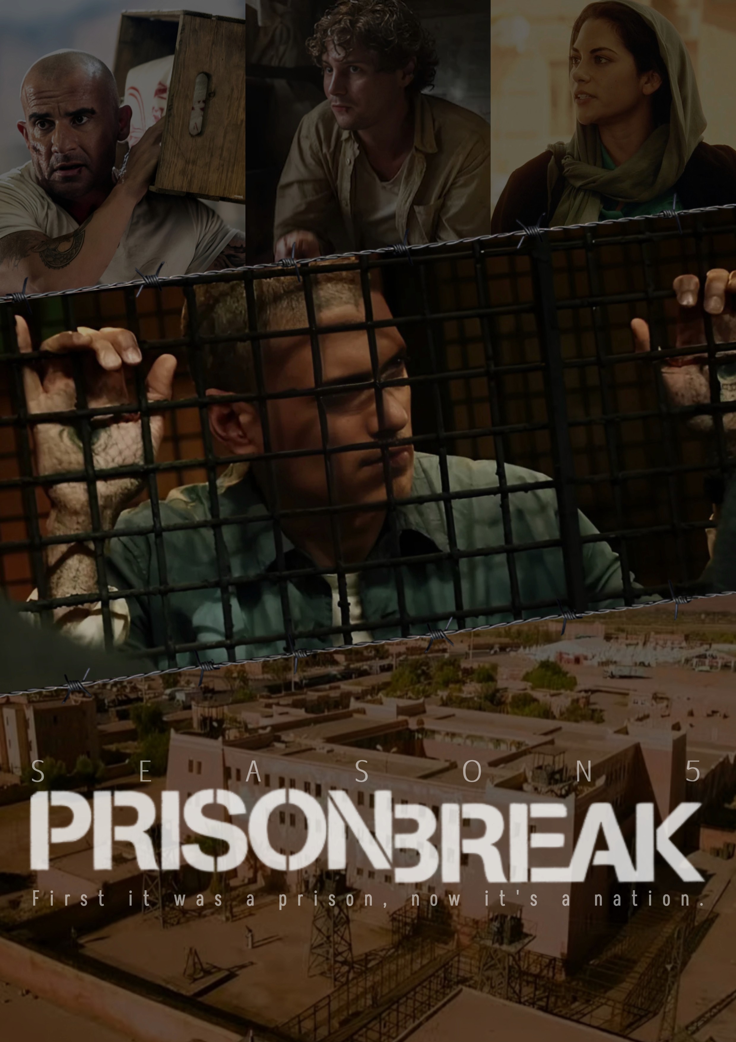
This poster for Prison Break: Season 5 visually represents the season’s themes of entrapment, survival, and redemption. Set in the brutal Ogygia Prison in Yemen, the story follows Michael Scofield as he fights to escape while the world believes him dead. The poster’s composition, typography, and colour palette work together to create a sense of urgency, tension, and mystery.
Key Takeaways
Concept: A cinematic poster reflecting Michael’s imprisonment and the high-stakes escape.
Layout: Layered storytelling with dynamic character placement.
Symbolism: The cage, barbed wire, and tagline reinforce themes of confinement and conflict.
Mood: Gritty, intense, and dramatic, using harsh lighting and desaturated tones.
Process: Research-driven approach, refined composition, and attention to realism.
Design Concept and Inspiration
The goal was to create a visually immersive poster that captures the psychological and physical struggles of Michael Scofield’s imprisonment. Research into Prison Break posters and similar thriller/drama designs informed the composition, ensuring the final image balanced storytelling, tension, and realism. The barbed wire dividers and dusty colour palette enhance the oppressive prison atmosphere, making viewers feel the weight of the setting.
Character Selection and Placement
Each character is carefully chosen and positioned to reflect their role in Michael’s escape:
Michael Scofield: The central figure, behind a metal cage, symbolizing his captivity and hidden plans. His tattooed and scarred hands gripping the bars hint at his past and struggles.
Lincoln Burrows: Carrying a crate, representing his active role in Michael’s rescue and his determination to do whatever it takes.
Whip (David Martin): A serious expression highlights his mysterious connection to Michael and hidden past.
Sheba: A key ally, with a determined look showcasing her strength and critical role in navigating the dangers of Yemen.
Typography and Layout
"Prison Break" (official font): Maintains series branding for recognition.
"Season 5" (Afta Sans): A clean, modern typeface for a sleek look.
Tagline ("First it was a prison, now it’s a nation.") (Akshar): A narrow, futuristic font that complements the dark and dramatic tone of the season.
The layout is structured into three sections to emphasize key elements:
Top Row: Showcases Lincoln, Whip, and Sheba—Michael’s core support system.
Middle Section: Michael behind bars serves as the dominant focal point, highlighting his isolation.
Bottom Section: A wide shot of Ogygia Prison, reinforcing the setting and tagline.
The barbed wire dividers subtly frame the sections, enhancing the prison-like aesthetic.
Colour and Mood
Earthy, dusty tones: Reflect the harsh Middle Eastern setting and intense conditions.
High contrast lighting: Casts strong shadows, reinforcing the brutality of Michael’s imprisonment.
Desaturated colours: Add a gritty, realistic feel, aligning with themes of survival, deception, and urgency.
Symbolism and Storytelling Elements
"First it was a prison, now it’s a nation": This tagline reflects how Season 5 elevates the stakes—Michael isn’t just escaping a prison, but a war-torn country controlled by extremists.
Barbed wire dividers: A visual metaphor for entrapment and extreme difficulty of escape.
Michael’s caged hands: Symbolize his loss of identity ("Kaniel Outis"), his suffering, and his psychological battle.
Deserted prison landscape: Reinforces that this isn’t just about escaping walls and guards—it’s about surviving a hostile nation.
Refinements and Process
This design underwent multiple refinements to perfect the lighting, color balance, and layout. Special attention was given to ensuring seamless blending of elements while maintaining a strong visual impact. The final composition effectively captures the essence of Prison Break: Season 5, creating a cinematic, tension-filled narrative in a single frame.
About the Series
This poster for Prison Break: Season 5 visually represents the season’s themes of entrapment, survival, and redemption. Set in the brutal Ogygia Prison in Yemen, the story follows Michael Scofield as he fights to escape while the world believes him dead. The poster’s composition, typography, and colour palette work together to create a sense of urgency, tension, and mystery.
Key Takeaways
Concept: A cinematic poster reflecting Michael’s imprisonment and the high-stakes escape.
Layout: Layered storytelling with dynamic character placement.
Symbolism: The cage, barbed wire, and tagline reinforce themes of confinement and conflict.
Mood: Gritty, intense, and dramatic, using harsh lighting and desaturated tones.
Process: Research-driven approach, refined composition, and attention to realism.
Design Concept and Inspiration
The goal was to create a visually immersive poster that captures the psychological and physical struggles of Michael Scofield’s imprisonment. Research into Prison Break posters and similar thriller/drama designs informed the composition, ensuring the final image balanced storytelling, tension, and realism. The barbed wire dividers and dusty colour palette enhance the oppressive prison atmosphere, making viewers feel the weight of the setting.
Character Selection and Placement
Each character is carefully chosen and positioned to reflect their role in Michael’s escape:
Michael Scofield: The central figure, behind a metal cage, symbolizing his captivity and hidden plans. His tattooed and scarred hands gripping the bars hint at his past and struggles.
Lincoln Burrows: Carrying a crate, representing his active role in Michael’s rescue and his determination to do whatever it takes.
Whip (David Martin): A serious expression highlights his mysterious connection to Michael and hidden past.
Sheba: A key ally, with a determined look showcasing her strength and critical role in navigating the dangers of Yemen.
Typography and Layout
"Prison Break" (official font): Maintains series branding for recognition.
"Season 5" (Afta Sans): A clean, modern typeface for a sleek look.
Tagline ("First it was a prison, now it’s a nation.") (Akshar): A narrow, futuristic font that complements the dark and dramatic tone of the season.
The layout is structured into three sections to emphasize key elements:
Top Row: Showcases Lincoln, Whip, and Sheba—Michael’s core support system.
Middle Section: Michael behind bars serves as the dominant focal point, highlighting his isolation.
Bottom Section: A wide shot of Ogygia Prison, reinforcing the setting and tagline.
The barbed wire dividers subtly frame the sections, enhancing the prison-like aesthetic.
Colour and Mood
Earthy, dusty tones: Reflect the harsh Middle Eastern setting and intense conditions.
High contrast lighting: Casts strong shadows, reinforcing the brutality of Michael’s imprisonment.
Desaturated colours: Add a gritty, realistic feel, aligning with themes of survival, deception, and urgency.
Symbolism and Storytelling Elements
"First it was a prison, now it’s a nation": This tagline reflects how Season 5 elevates the stakes—Michael isn’t just escaping a prison, but a war-torn country controlled by extremists.
Barbed wire dividers: A visual metaphor for entrapment and extreme difficulty of escape.
Michael’s caged hands: Symbolize his loss of identity ("Kaniel Outis"), his suffering, and his psychological battle.
Deserted prison landscape: Reinforces that this isn’t just about escaping walls and guards—it’s about surviving a hostile nation.
Refinements and Process
This design underwent multiple refinements to perfect the lighting, color balance, and layout. Special attention was given to ensuring seamless blending of elements while maintaining a strong visual impact. The final composition effectively captures the essence of Prison Break: Season 5, creating a cinematic, tension-filled narrative in a single frame.