Apple
Social
Media
Post
Apple
Social
Media
Post
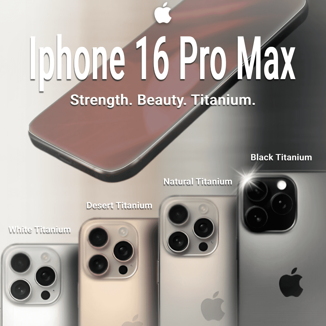
TL;DR: I designed a visually compelling social media post for the iPhone 16 Pro Max, emphasizing its sleek design and powerful features. The design process involved careful consideration of brand consistency, visual hierarchy, and color theory, resulting in a polished and engaging final product.
Design Process:
Initial Design: Started with the official Apple font and website imagery to maintain brand consistency.
Used a dark gray background with a subtle fabric texture for a modern aesthetic.
Featured the key message "Strength. Beauty. Titanium." prominently.
Background Refinement:
Changed the background to a Titanium texture to connect with the phone's material.
Introduced color gradients based on the phone colors for visual cohesion.
Added subtle reflections of the phones on the texture for realism.
Color and Lighting:
Added glow effects to the camera and screen for visual interest.
Created a subtle shadow effect using a duplicated phone image with a "Multiply" blend mode.
Sharpened the phone images for improved quality.
Introduced ambient lighting for a more realistic scene.
Choice of Elements:
Font: Used the official Apple font for brand consistency.
Layout: Employed a clean and minimalist layout to align with Apple's design philosophy.
Icon: Placed the Apple logo in the bottom right corner for visual balance and brand recognition.
Color Palette: Used a color palette inspired by the Titanium colors of the phones for visual appeal.
Reasoning Behind Choices:
Brand Consistency: Maintained a consistent brand identity through the use of official Apple elements.
Visual Appeal: Created a visually engaging composition to capture attention.
Clarity and Communication: Designed the layout to clearly communicate the key features of the iPhone 16 Pro Max.
Refinement and Polish: Employed an iterative design process with attention to detail for a polished final product.